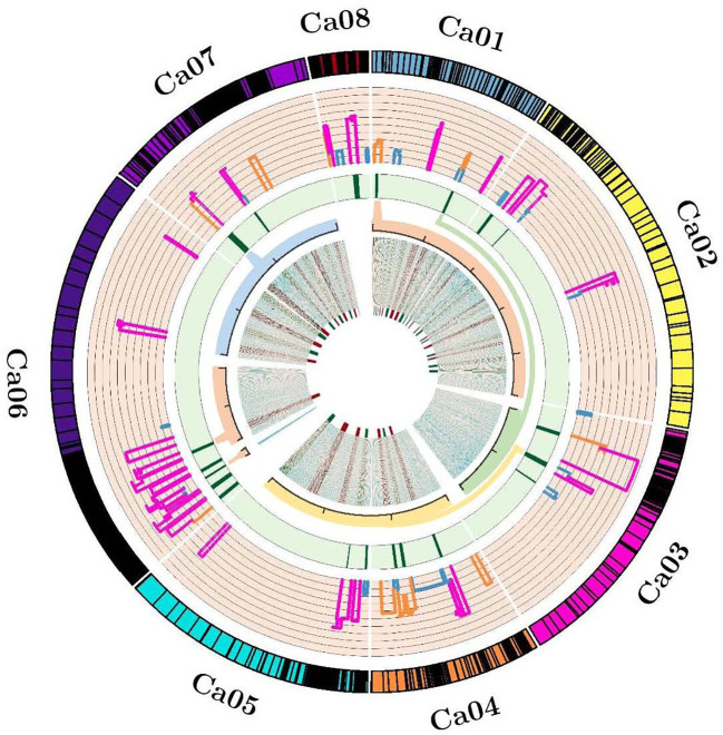
Figure 2.
Circos indicating the projected QTLs, Meta-QTLs and genes. From outside to inside , Track 1 representing ideogram of linkage groups and black bands are showing marker density; Track 2 representing the histogram of projected QTLs and width of histogram is showing the confidence interval; Track 3 representing heatmap of identified Meta-QTLs and width of heatmap is indicating the reduction in confidence interval of Meta-QTLs; Track 4 representing magnified view of accepted Meta-QTL regions into the redundant physical interval; Track 5 representing the density map of identified candidate genes.

