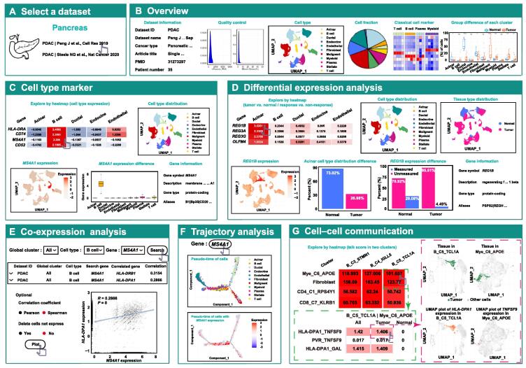
Figure 2.
Web interface and usage of “single-cell immunity” module in TIGER
A. The interface for users to select the ones that they are interested in. B. Overview tab. First in the first row: dataset information. Second in the first row: density plot showing quality control. Third in the first row: UMAP plot showing the pre-analyzed clustering results of selected main lineage cells. Fourth in the first row: pie plot showing the proportion of each of main lineage cells. Fifth in the first row: heatmap showing the classical cell markers of each of the main lineage cells. Sixth in the first row: boxplot comparing the percentage of cell number of the main lineage cells between normal and tumor. C. Cell type marker tab. First in the first row: heatmap showing the expression of gene markers in each cell type. Second in the first row: UMAP plot showing the cell types of the main lineage cells (color-coded for cell types). First in the second row: UMAP plot showing the expression of the selected gene in the selected main lineage cells (color-coded for gene expression abundance). Second in the second row: boxplot showing the differential expression of the selected gene in different cell types of the selected main lineage cells. Third in the second row: gene information. D. Differential expression analysis tab. First in the first row: heatmap showing the differential expression of all genes in each cell type between tumor and normal or between response and non-response. Second in the first row: UMAP plot showing the cell types of the selected main lineage cells (color-coded for cell types). Third in the first row: UMAP plot showing the tissue types of the selected main lineage cells (color-coded for tissue types). First in the second row: UMAP plot showing the expression of the selected gene in the selected main lineage cells (color-coded for gene expression abundance). Second in the second row: barplot showing the selected cell type distribution difference between tumor and normal. Third in the second row: barplot showing the differential expression of the selected gene between tumor and normal. Fourth in the second row: gene information. E. Co-expression analysis tab. Top: table of the correlation of the selected gene and relevant gene in selected dataset. Bottom: a plot visualizing the correlation of the selected gene and relevant gene. F. Trajectory analysis tab. The trajectory analysis showing the expression of the genes of interest in the pseudotemporal ordering of cells. G. Cell–cell communication tab. UMAP, uniform manifold approximation and projection.

