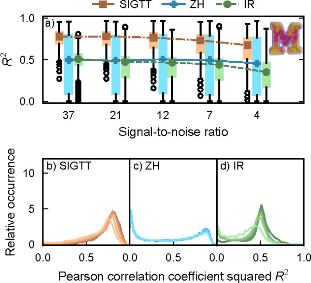
Figure 2.
Correlations for sample ‘M’. (a) Box plots of R 2 as defined in equation (15), with lines and symbols indicating the respective median of each box plot. Outlier dots each represent 100 voxels. (b)–(d) Correlation coefficient distribution for each of the three methods. The signal-to-noise ratio goes from 37 (darkest lines) down to 4 (lightest lines). The image inset shows a volume render of the simulated sample.

