


Fig. 1.
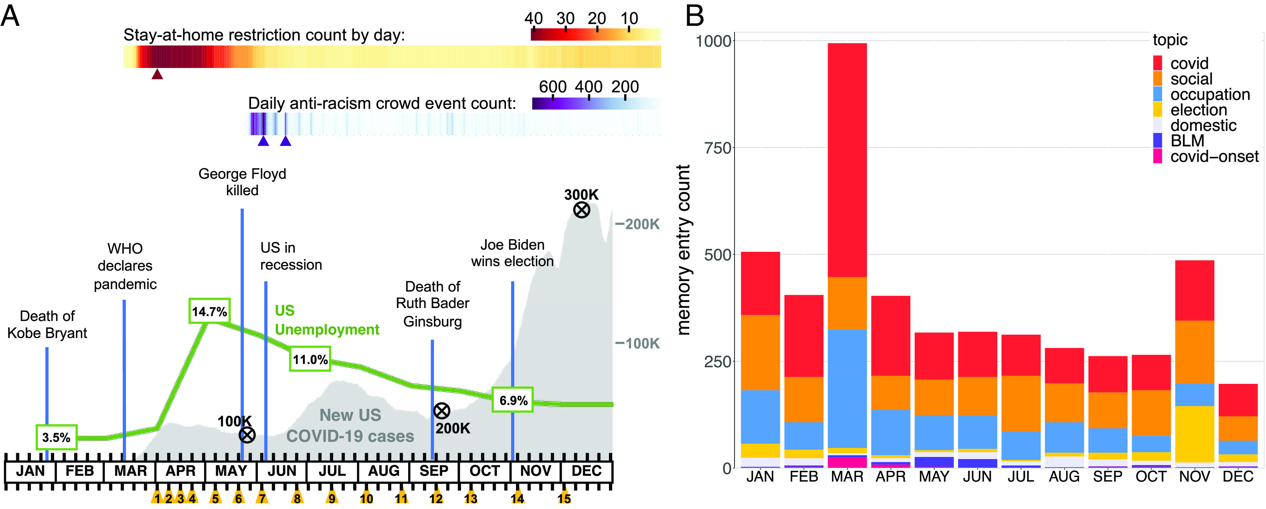
(A) Timeline of real-world events in the United States and COVID-Dynamic administrations across 2020. Orange triangles denote each wave administration (black tick marks depict weekly intervals). The gray curve indicates the daily 7-d average of new, confirmed COVID-19 cases in the United States, black encircled X’s on top of the curve indicate death milestones. The green line shows the monthly unemployment rate. The upper gradient (yellow-red) indicates the daily count of states with active stay-at-home restrictions (peak = 41). The lower gradient (blue-purple) shows the daily count of US antiracism crowd events initiated after the murder of George Floyd. Triangles below the gradients indicate local maxima for the various measures. Events of interest are indicated with vertical blue lines (credit: COVID-Dynamic Study, data are publicly available, see SI Appendix, section 5.1 for resources; 20). (B) Topic modeling for 2020 autobiographical memory distributed by month (memory recalled in December 2020, see SI Appendix, section 2.3 for topic modeling of all sets). Memory entry count (Y axis) represents the number of memory entries, grouped by topic category. Topics included categories related to personal matters (“social,” “occupation,” and “domestic”) as well as real-world events (“covid,” 2020 presidential “election,” Black Lives Matter movement (“BLM”), and “‘covid-onset” which describes the conditions of the early pandemic (e.g., toilet paper shortage); see SI Appendix, Table S2 for keywords associated with each topic. A similar pattern of topics was observed for all 2020 memory collections (but not for 2021 memory, which included different real-world topics, SI Appendix, Fig. S2).