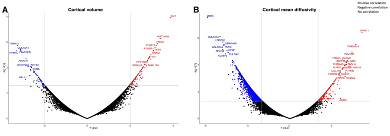
Figure 3.
Scatterplot representing the genes associated with cortical cell loss. The y axis represents the logarithmic of the P value while the x axis shows the T value. The horizontal line represents the threshold for significance while the vertical lines show the T = 2 threshold for gene expression positively (right side) or negatively (left side) correlated with cortical volume loss (A) and increases in cortical diffusivity (B). The “ggrepel” package in Rstudio was used to avoid label overlap.

