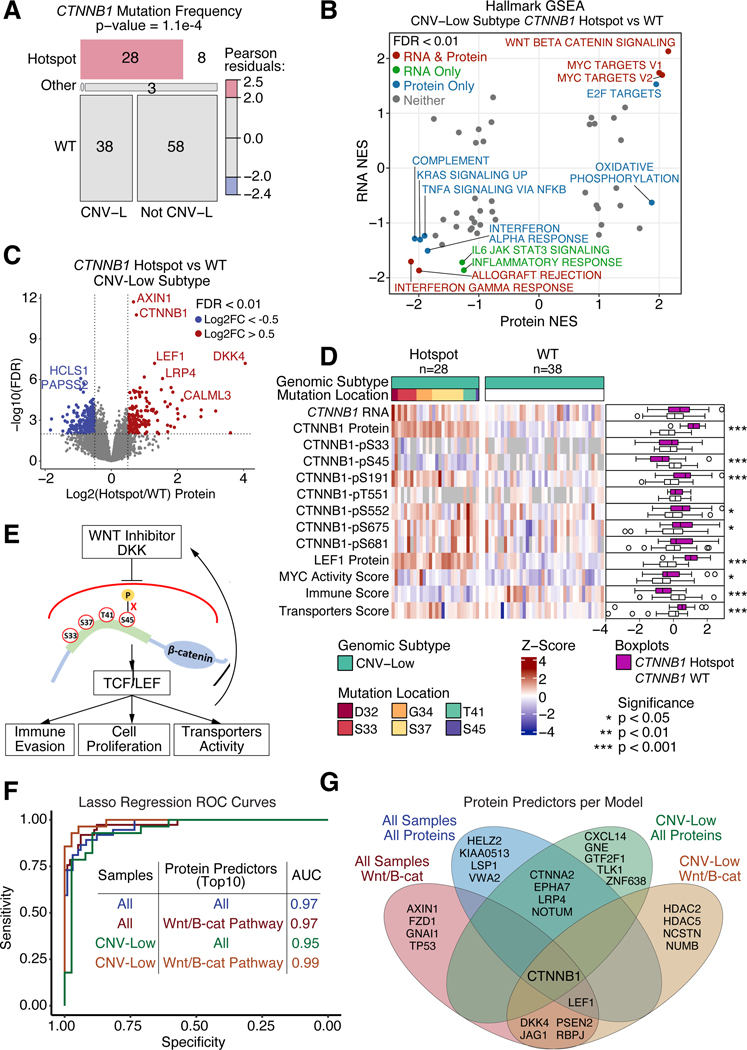
Figure 5: CTNNB1 hotspot mutations block DKK induced degradation.
(A) Mosaic plot showing distribution of CTNNB1 mutations across CNV-L tumors versus all other tumors in the independent cohort. P-value determined from Chi-Square Test.
(B) Scatter plot of pathway Normalized Enrichment Scores (NES) comparing CTNNB1 hotspot mutant versus WT CNV-L tumors at the protein (x-axis) and RNA (y-axis) levels in the independent cohort. Points with FDR < 0.01 at both protein and RNA levels are colored in red, RNA only are in green, protein only are in blue, and neither are in gray.
(C) Volcano plot of protein log2 fold change (x-axis) between CTNNB1 hotspot and WT CNV-L tumors versus −log10 FDR (y-axis) determined by Student’s T-test. Points with FDR < 0.01 and log2 fold change < −0.5 or > 0.5 are shown in blue and red, respectively.
(D) Heatmap showing mRNA, protein, and phosphoprotein values for CTNNB1, LEF1 protein, MYC activity score, Immune Score, and Transporters Score across CNV-L tumors with and without CTNNB1 hotspot mutations. Side panel showing boxplots (right) compares mutants versus WT tumors. P-values determined by Wilcoxon Rank Sum Test.
(E) Schematic depicting proposed downstream implications of hotspot mutations in CTNNB1.
(F) ROC curves of Lasso regression models predicting CTNNB1 hotspot mutation status using exploratory protein data as training and independent protein data as testing. Models vary by which samples (all tumors or just CNV-L tumors) and which proteins (all proteins or only Wnt- β-catenin pathway proteins) were used.
(G) Venn diagram showing top 10 proteins selected by regression analysis per model.
Boxplots: Box portion represents Interquartile range (IQR), midline corresponds to the median, and whiskers range from the minimum (bottom) and maximum (top) variability outside the first and third quartiles (Q1 and Q3). Outliers are shown as points above whiskers.

