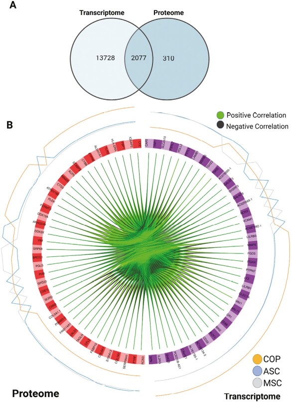
Figure 3.

Interaction results. (A) Venn diagram of results from the intersection analysis. (B) Circus plot from multiblock sPLS-DA. The plot represents the top 30 genes with a correlation greater than 0.7 between variables (cells) of different types, represented on the side quadrants. The internal connecting lines show the positive/negative correlations. The outer lines show the expression levels of each cell type in each group. This plot enables to visualize the cross-correlations between data types (proteome vs. transcriptome), and the nature of these correlations (positive/negative). Each node represents a selected variable with colors indicating their type (green = proteins, purple = transcripts). The color of the edges represents positive or negative correlations.
