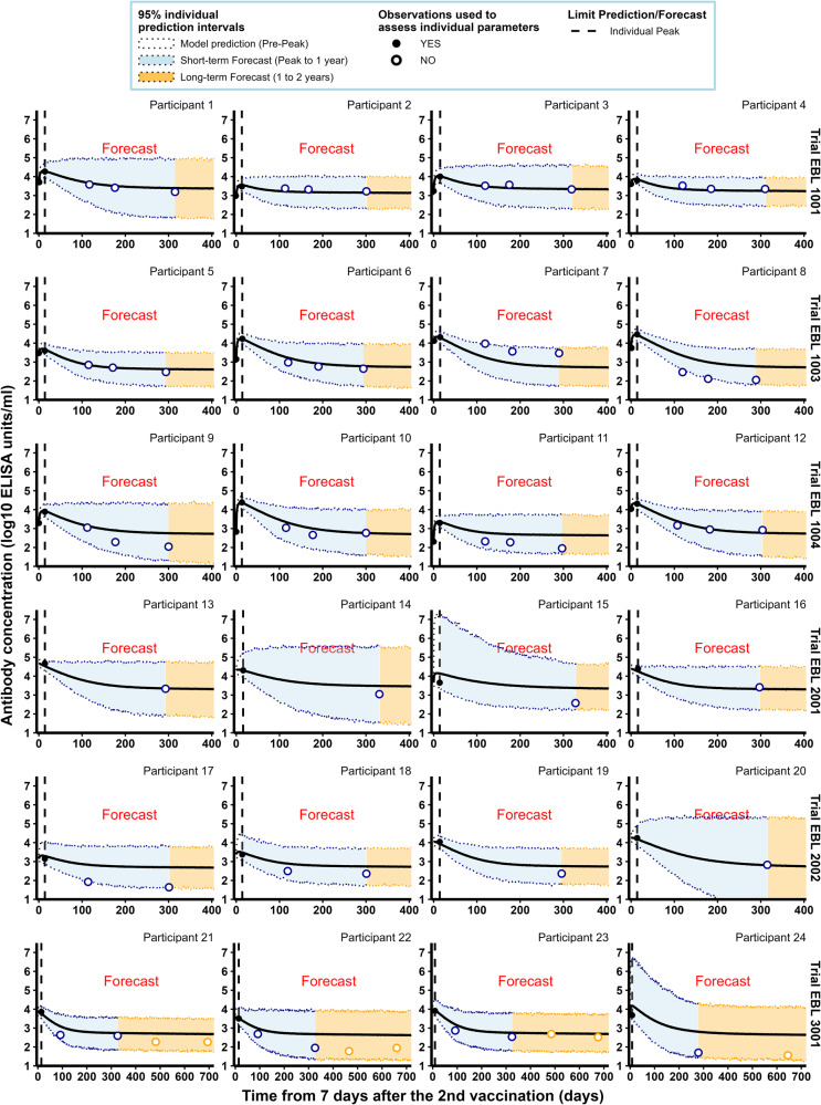
Fig. 3. Individual antibody concentrations predicted by the model, estimated on Phase I data, for a random sample of participants from the six clinical studies.
Each subplot represents the individual antibody dynamics (in log10 ELISA units/mL) from 7 days after the 2nd vaccination. For each participant, the vertical dashed line represents the time limit (individual peak of dynamics) between the predictions (on the left) and the forecasts (short-term in blue and long-term in orange). Plain dots correspond to observations used to evaluate individual parameters while circles are observations not used in parameter estimation. Shaded areas correspond to 95% individual prediction intervals (accounting for the uncertainty on the individual parameter estimation and the measurement error) and the solid lines correspond to the prediction of the model.

