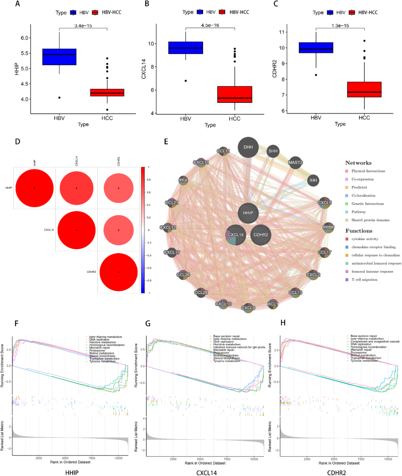
Fig. 6.
Feature gene correlation analysis. (A–C) Box line plots of differential expression of HHIP, CXCL14 and CDHR2 in HBV versus HBV-HCC. The range of sizes of the box line plots indicates the range of their gene expression, while the black line in the plot indicates the mean of their expression. The values between the two box line plots are p-values, and the differences are statistically significant when p < 0.05. (D) Heat map of correlation between the three feature genes. Red represents positive correlation with each other, blue represents negative correlation with each other, and larger circles with redder colors represent greater correlation. *p < 0.05.(E) GeneMANIA network diagram of the three feature genes, the 20 genes in the outer circle are the similar genes of the feature genes, and the interconnected lines indicate the correlation between them, and the different color modules in the genes represent the different functional pathways enriched. (E–F) Single gene GSEA analysis of HHIP, CXCL14 and CDHR2, respectively, and the top five pathways with the highest and lowest enrichment significance were selected for display.

