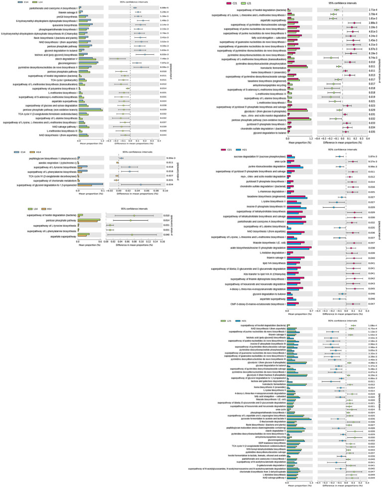
Figure 4.
Comparison of PICRUSt-predicted functional pathways between two groups (control vs. low-dose, control vs. high-dose, low-dose vs. high-dose) on days 14 and 21. The extended error bar plots show the significantly different MetaCyc pathways between the two groups. Bar plots on the left display each group’s mean proportion of pathway. Dot plots on the right show the difference in the mean proportions between the two groups using Welch’s t-test (two-sided).

