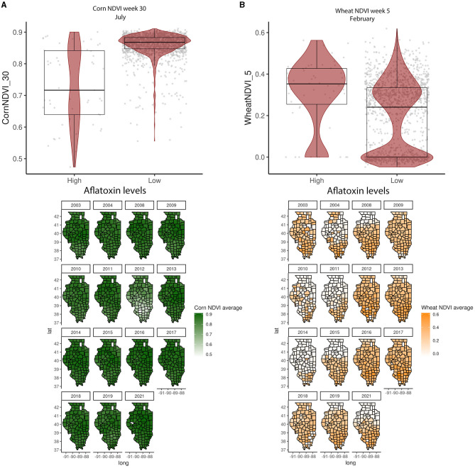
Figure 3.
Crop-specific NDVI relationship with AFL contamination levels and their spatial distribution in Illinois from 2003 to 2021. (A) Corn NDVI in week 30 (July); (B) wheat NDVI in week 5 (February). Box–Whisker plot depicts the maximum (25th – 1.5 * interquartile range “IQR”) and minimum [75th percentile + 1.5 * interquartile range (IQR)], and the Box–Whisker plot depicts median, first (25th percentile), and third (75th percentile) quantiles distribution. For AFL, high is >20 ppb and low ≤20 ppb. The violin plot is shaded in red and depicts the density distribution of the soil property in low and high levels of mycotoxin contamination. The gray dots depict each data point. Maps show the average NDVI values for corn (green) and wheat (yellow) for specific weeks each year.

