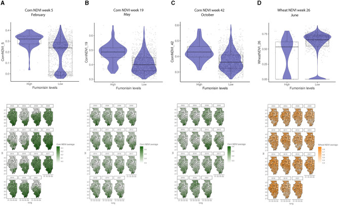
Figure 6.
Crop-specific NDVI relationship with FUM contamination levels and their geospatial distribution in IL from 2003 to 2021. (A) Corn NDVI in week 5, February, (B) corn NDVI in week 19, May, (C) corn NDVI in week 42, October, (D) wheat NDVI in week 26, June. Box–Whisker plot depicts the maximum (25th – 1.5 * interquartile range “IQR”) and minimum [75th percentile + 1.5 * interquartile range (IQR)], and the Box–Whisker plot depicts median, first (25th percentile) and third (75th percentile) quantiles distribution; For FUM, high is >5 ppm, and low ≤5 ppm. The violin plot is shaded in blue and depicts the density distribution of the corn or wheat NDVI in low and high levels of mycotoxin contamination; and gray dots depict each data point. Maps of geography are shaded in relation to corn NDVI (green) or wheat NDVI (yellow) values for specific weeks in each year.

