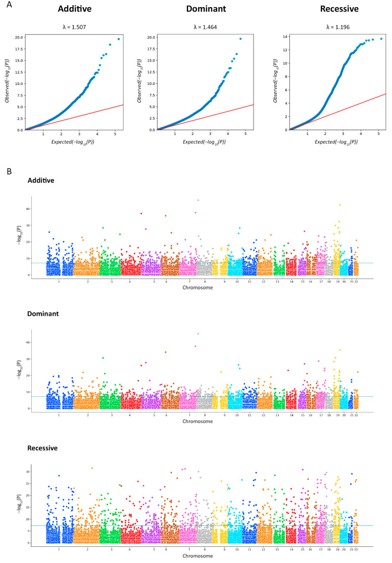
Figure 2.
The Q-Q plots for association analysis. Each figure shows the expected (x-axis) and observed (y-axis) log (p-values) (A). The Manhattan plots for the exome-wide association study (EWAS) of IgA nephropathy (IgAN). The figure shows the p-value for the association with the disease (expressed as a negative logarithm of the p-value, y-axis) for each tested marker plotted against the chromosomal position of the markers (x-axis). The blue line at 6 represents the threshold for EWAS (−log10(1 × 10⁻⁶)) (B).

