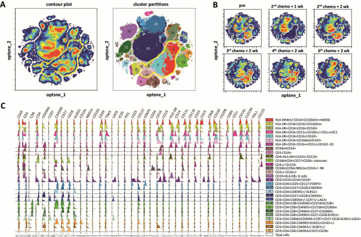
Figure 4.
Detailed evaluation of treatment effect on circulating leukocyte populations. PBMCs were isolated from venous blood samples collected at the indicated time points before and during treatment and stained with a panel of 40 markers indicated in online supplemental table 1. High-dimensional single cell data analysis of the stained PBMC was performed by opt-Distributed Stochastic Neighbor Embedding (optSNE) and FLOWSOM using OMIQ software (A) OptSNE plots visualizing a contour plot (left) and cluster partitions by FLOWSOM (right) for all patient samples. Populations representing myeloid cells are indicted by the yellow bordered area. (B) Changes of the cell clusters visualized in contour plots are shown for the different time points and show clear reduction of the myeloid cell populations, especially at 1 week after the second chemotherapy cycle. (C) The major and/or specific combination of markers distinguishing the defined cell populations are indicated (on the right) and the complete expression profile for each individual marker (indicated above the graph) is shown for each cell population (in different colors) and for the total cell population (in white, lower panels) in histogram plots. PBMC, peripheral blood mononuclear cell.

