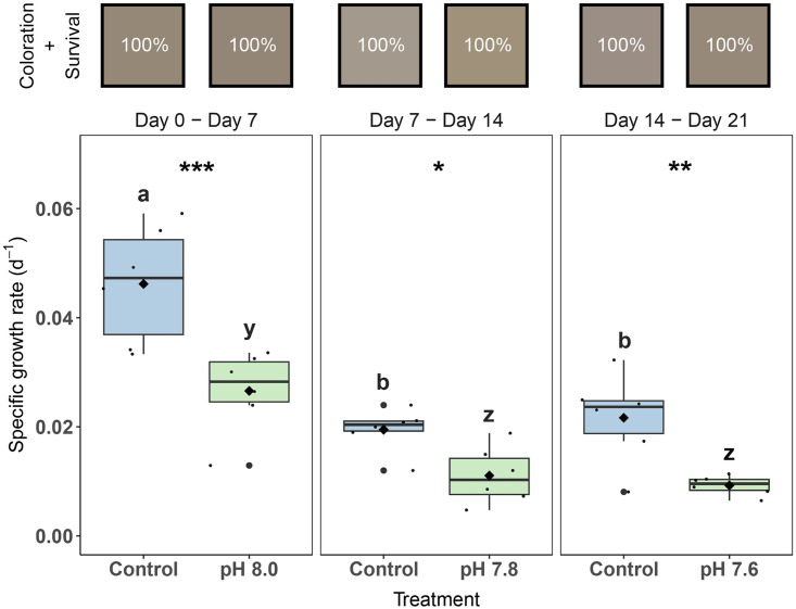
Fig 2. Specific growth rates, visual coloration, and survival of Xenia umbellata exposed to ocean acidification (OA).
Color squares represent the average color of the colonies in its respective treatment (#HEX, based on Red, Green and Blue [RGB] values of photographs). Percentages inside the color squares refer to coral colonies that survived the treatment; i.e., all colonies survived in every treatment. The black horizontal line in each boxplot represents the median, while the black diamond represents the mean. Blue boxplots are controls; green boxplots are the OA treatments. Small black circles represent data points (ntreatment = 6), and big black circles represent outliers. Significant differences (p < 0.05) within treatments between days are shown by different letters, while differences between treatments per day are shown by asterisks (* p < 0.05, ** p < 0.01, *** p < 0.001).

