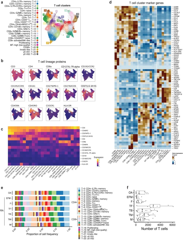
Extended Data Fig. 3. T cell-specific analysis.
a, T cell UMAP colored by fine-grained cell-state clusters, b, Expression of selected surface proteins among T cells. Cells are colored from blue (low) to yellow (high), c, Heatmap of surface protein expression in T cell clusters colored according to the average normalized expression across cells in the cluster, d, Heatmap of gene expression in T cell clusters colored according to the average normalized expression across cells in the cluster, scaled for each gene across clusters, e, Distribution of T cells across clusters, stratified by CTAP. The size of each segment of each bar corresponds to the average proportion of cells in that cluster across donors from that CTAP. f, Number of T cells per individual, stratified by CTAP. Points represent individuals (N = 82); OA (N = 9), (EFM (N = 7), F (N = 11), TF (N = 8), TB (N = 14), TM (n = 12), M (N = 18). Box plots show median (vertical bar), 25th and 75th percentiles (lower and upper bounds of the box, respectively) and 1.5 x IQR (or minimum/maximum values; end of whiskers).

