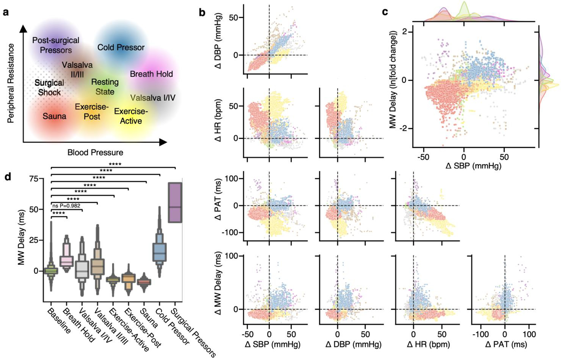
Fig. 5 |. Hemodynamic measurement scatterplots.

a, Theoretical plot between peripheral resistance and BP, indicating hypothesized relationships of different hemodynamic stimuli. b, Baseline-subtracted scatterplots between HR (bpm), PAT (ms), MW delay (ms) and systolic/diastolic BP (mmHg), with each sample color coded by stimulus as in a. To control for inter-participant variability, the median of the baseline state, indicated by crosshairs, is subtracted from each datapoint. c, Scatterplot of the MW delay fold change on a logarithmic axis against BP, showcasing separation of stimuli into groupings in similar positions as in a, with kernel density estimates of distributions of these quantities outside each axis. Note the overlap of sauna and surgical pressor distributions on the BP axis, indicating that two very different states are not adequately separable using BP alone, but begin to be distinguished with the addition of MW delay. d, Letter-value plots of MW delay measurements during each hemodynamic state. In letter-value plots, each progressively smaller pair of boxes around the center value (median) represents a power of 2 smaller fraction of the data points, such as fourths, eighths, sixteenths and so on. Brunner–Munzel tests between each stimulus and the baseline distribution; NS, not significant, ****P < 0.0001.
