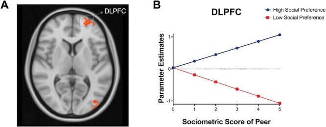
Fig. 3.

Brain activation when tracking high vs low social preference peers. (A) Whole-brain results for high > low social preference peers (with PMs). (B) For descriptive purposes to visualize how these brain regions track high social preference peers relative to low social preference peers (i.e. most liked vs least liked peers), we plotted the parameter estimates (β) from the activated regions. The x-axis represents the absolute value of social preference score, such that high z-scores represent the sociometric statuses for most liked peers and the least liked peers, and the y-axis represents mean activation in each brain region. See Supplementary Figure S2 for the distribution of β values in DLPFC across participants.
