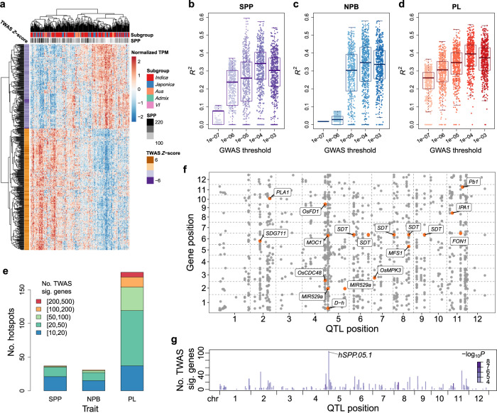
Fig. 4. Associations between GWAS QTLs and TWAS significant genes.
a Expression patterns of the top 500 TWAS significant genes of SPP in the 275 varieties. Each column is a variety, and each row is a gene. b–d R2: the square of the Pearson correlation coefficient between the panicle trait and the predicted expression values of the top 500 TWAS significant genes of SPP (b), NPB (c), and PL (d), respectively. Each point represents a gene. The predicted expression values are predicted using the LASSO model based on lead variants of GWAS QTLs identified at different thresholds in the 275 varieties’ panel. For each box plot, the center line represents the median, the box’s lower and upper boundaries indicate the first and third quartiles, and the whiskers extend to data points within 1.5 times the interquartile range from the box. e Bar plot of the number of pQTL-eQTL hotspots for TWAS significant genes. A GWAS QTL of panicle traits (pQTL, p value <1 × 10⁻⁴) is defined as a pQTL-eQTL hotspot if it is an expression quantitative trait locus (eQTL, p value <1 × 10⁻⁴) for many genes and these genes are significantly enriched for more than 10 TWAS significant genes (BH-adjusted one-sided Fisher’s exact test p value <0.05). The pQTL-eQTL hotspots are categorized according to the number of TWAS significant genes in the associated targets and indicated by different colors. f Associations between the expression levels of TWAS significant genes and pQTLs for SPP. The genomic positions of TWAS significant genes (y-axis) are plotted against the positions of lead variants of pQTLs (x-axis) for each significant association. Known panicle development-related genes associated with pQTL-eQTL hotspots are labeled and marked as orange dots. g The number of TWAS significant genes associated with each GWAS QTL of SPP. The color of each bar represents the −log10 p value of GWAS for that QTL. Source data underlying (b–g) are provided as a Source Data file.

