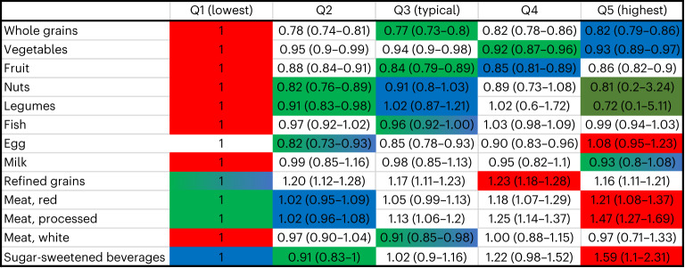
Fig. 1. Hazard ratio for all-cause mortality per food group for each quintile (Q1–Q5) among UK Biobank participants.
Data are presented as hazard ratios and their 95% confidence intervals. The reference groups were the lowest quintile of intake for each food group. The analyses were adjusted for age, sex, area-based socio-demographic deprivation, smoking, alcohol consumption and physical activity level. The unhealthy categories are shown in red, the longevity associated are shown in green and dark green, and the Eatwell recommendations are shown in blue. The dark green category had large uncertainties; thus, the robust version of the healthiest dietary patterns is in green (not dark green).

