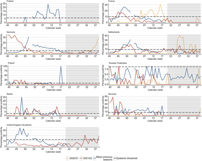
FIGURE 2.

Summary of Moving Epidemic Method (MEM) calculations (calculated by authors) comparing percentage positivity in pre‐COVID‐19 pandemic seasons (2016/17 to 2019/20) and 2020/21 (weeks 40/2020 to 39/2021) and 2021/22 (weeks 40/2021 to 39/2022) seasons, where possible in the selection of countries included. Horizontal lines represent the epidemic threshold for each season where it could be calculated. Note: grey rectangles represent inter‐seasonal periods; the same epidemic threshold calculations were used for the 2021/22 and 2020/21 season. More detailed results can be found in Table S2.
