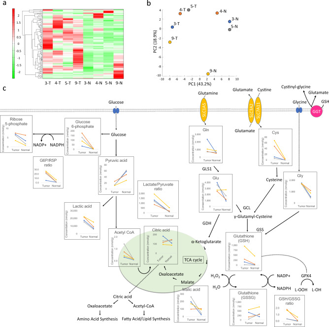
Figure 1.
Comparison of CCC and normal ovarian tissues by metabolic analysis. Heatmap analysis showing metabolite profiles of each sample (a). Hierarchical clustering analysis (HCA) was performed using the metabolites detected in this study, and the results are shown in the heatmap display. The x-axis indicates the sample name, and the y-axis indicates the peak. HCA was performed on the peaks, and the distance between the peaks is shown using a tree diagram. Dark green indicates that the sample is smaller than the average, and dark red indicates that the sample is larger than the average. Principal component analysis (PCA) of the metabolome analysis (b); PC1 and PC2 indicate the first and second principal component scores, respectively, and the numbers in parentheses indicate the percentage contributions of each principal component. Schema of GSH metabolism and associated pathways (c). Absolute concentrations, lactate/pyruvate ratio, G6P/R5P ratio, and GSH/GSSG ratio for each metabolite in tumor and normal ovarian tissues are shown. Line colors in the graph are indicated in blue for case 3, orange for case 4, gray for case 5, and yellow for case 9.

