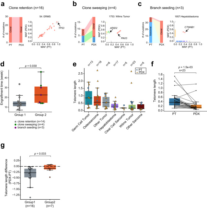
Fig. 3. Evolutionary patterns from PTs to PDXs.
a A sample that shows clone retention. Left, sankey plot showing mutation clonality flow from the PT to PDX. The width of the joining lines reflects the number of mutations. Right, scatter plot of tumor mutant allele fraction (MAF) between the PT (x axis) and PDX (y axis). Cancer-related genes are highlighted with arrows. Similarly, b clone sweeping, c branch seeding. d Longer engraftment time for group 2 tumors. Each dot represents one PDX. Y axis represents the time in weeks from initial implantation to harvest. P-value was calculated with two-sided Wilcoxon rank sum test. The box represents the interquartile range (IQR), and middle line represents median. Whiskers represent values within 1.5×IQR of the upper and lower quantiles respectively. e Telomere length across cancer types. Each dot represents one sample. Boxplot is interpreted similarly as above. f Comparison of telomere length between paired PTs and PDXs. The box is interpreted similarly as above. P-value was calculated with paired two-sided Wilcoxon rank sum test. g Longer relative telomere lengths in group 2 PDXs. Y axis represents the difference in telomere length for paired PT and PDX. The dashed line indicates no telomere length difference between PT and PDX. P-value was calculated with two-sided Wilcoxon rank sum test. Boxplot is interpreted similarly as above. Source data are provided as a Source data file.

