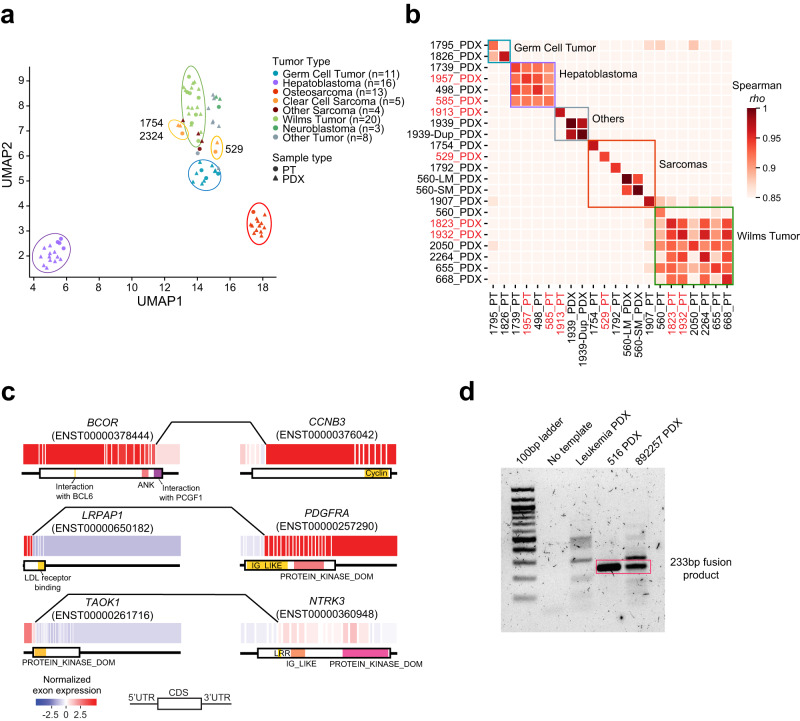
Fig. 6. Transcriptomic similarity and gene fusion.
a UMAP visualization for samples with expression data. Each dot represents a sample (circle, PT; triangle, PDX), and the color reflects tumor type. b Expression similarity of paired samples. The correlation coefficient was calculated using Spearman’s correlation. Samples labeled in red are from group 2. c Example gene fusions. Each box represents an exon, and lines connecting the two genes indicate fusion breakpoints. Protein domains are shown below the exon plot. d RT-PCR validation of LRPAP1-PDGFRA fusion transcript. The red rectangle indicates LRPAP1-PDGFRA fusion bands. A leukemia sample was included as negative control. This experiment was repeated twice. Source data are provided as a Source data file.

