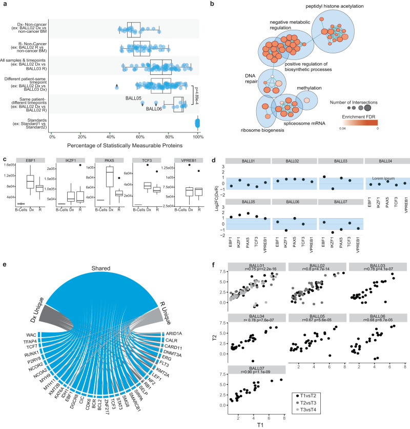
Fig. 3. Cancer-associated proteins and processes remain stable through disease progression.
a Summary of tests for equivalence (Two-one-sided t-test (TOST) for equivalence, boundaries between log2FC < −1 and log2FC > 1, FDR < 5%) of protein abundance between different groups and pairings. Only statistically measurable proteins are represented. Each dot represents the mean equivalence or difference of all protein abundance for a pairing. The Mann–Whitney U test (two-sided) was used to test the difference between the two groups’ percent equivalence boxplots (same patient-different timepoint vs different patient-same timepoint). The number of comparisons in each group from top to bottom are n = 21 pairs, n = 45 pairs, n = 76 pairs, n = 98 pairs, n = 17 pairs, and n = 210 pairs. Box represents the interquartile range (IQR), the middle line represents the median and the whiskers extend to 1.5 × IQR. b Pathway enrichment analysis of the stable population of proteins. The color of the circles indicates the enrichment FDR and size represents the number of identifications for the term. c Abundance of transcription factors of interest for each sample separated by timepoint (T1 or T2, black) compared to protein abundance in mature B-cells (n = 2 samples) isolated from peripheral blood mononuclear cells (gray). Box represents the IQR, the middle line represents the median and the whiskers extend to 1.5 × IQR. d Dot plots represent the log2FC of timepoint 1(T1)/timepoint 2(T2) for each of the proteins for each sample. The shaded blue area indicates the stable range of −1 to 1FC. *For patients with multiple timepoints (BALL01 and BALL02) only the log2ratio of the earliest timepoint/the latest timepoint is represented for simplicity. e From the list of 269 pediatric cancer-associated proteins (CAPs), 141 proteins were detected in our data and 45 proteins were deemed significant (LIMMA analysis of Dx samples vs. non-cancer bone marrow (BM) samples and R vs non-cancer BM samples (log2FC > 1, p-value adjusted BH-FDR < 0.05). Circos plot summarizes significantly over-abundant cancer-associated proteins (CAPs). f The protein abundance for each protein that was over-abundant at Dx (n = 22 proteins), was plotted as timepoint 1 (T1) vs timepoint 2 (T2), where T1 is the earliest timepoint available (log2(protein expression/the average protein expression in the non-cancer BM)). Pearson’s r correlation was calculated for all sample pairs. In cases of multiple time-points the correlation was calculated for consecutive pairings and are represented by the different colored dots.

