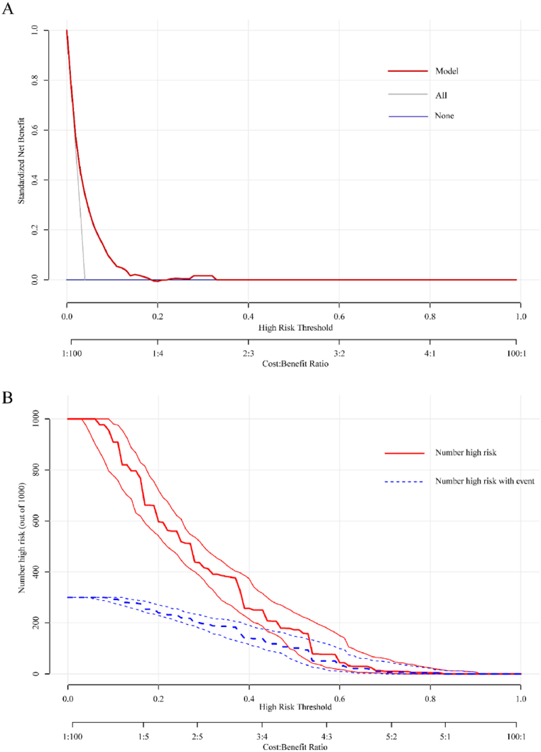
Fig. 4.
Decision curve analysis (DCA) and clinical impact curve analysis (CICA) of the nomogram. (A) DCA for the nomogram. The y-axis measures the net benefit. The red line represents the nomogram. The blue line represents the assumption that no participants had OLGIM III-IV, and the grey line represents the assumption that all participants had OLGIM III-IV. (B) CICA for the nomogram. The red curve is the number of participants characterized as positive (high risk) by the nomogram model under each threshold probability; the blue curve represents the number of true positives at each threshold probability. (For interpretation of the references to colour in this figure legend, the reader is referred to the Web version of this article.)

