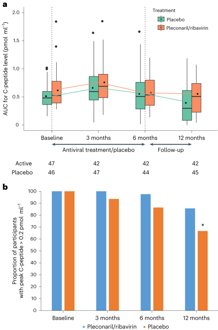
Fig. 2. Residual insulin production.

a, AUC for C-peptide levels. The box plots report the distribution of AUCs for the C-peptide levels. The numbers beneath the xaxis reflect the number of participants in each group with the respective endpoint at each time point. The line inside the box represents the median; the box boundaries represent the 25th and 75th percentiles (the box is the interquartile range (IQR)); the whiskers represent the highest or lowest values within 1.5× the IQR; the points outside 1.5× the IQR represent the potential outliers, including the maximum and minimum values. The C-peptide levels after 12 months were higher in the pleconaril and ribavirin group compared with the placebo group (AME = 0.057, P = 0.037 from the linear mixed model). b, Peak stimulated C-peptide. The proportion of participants with peak serum C-peptide greater than 0.2 pmol ml−1 at different visits, divided according to antiviral treatment and placebo. *P = 0.04 in the logistic model; risk ratio = 1.29; two-sided 95% CI = 1.03–1.65.
