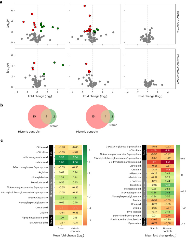
Fig. 3. Plasma metabolites after allogeneic HCT compared to baseline.
a, Volcano plots based on two-sided paired t-tests run by comparing each metabolite at different time points of the same patient within each cohort. The paired method was used to account for repeated sampling and a two-sided alternative hypothesis given the possibility of positive or negative correlations. For all plots, the y axis is the negative logarithm of the P value and the x axis is the logarithm of the fold change between the two time points being compared. The green and red dots show data points that are statistically significant. The top three plots are in the historical control cohort. Left, volcano plot comparing the nadir to baseline. Middle, engraftment compared to baseline. Right, day 100 compared to baseline. The bottom three plots are in the RS cohort. Left, volcano plot comparing the nadir to baseline. Middle, engraftment compared to baseline. Right, day 100 compared to baseline. These plots show changes in plasma metabolites at the nadir and engraftment after allogeneic HCT compared to baseline independent of whether recipients of allogeneic HCT received RPS. b, Venn diagram showing that overall, the RS cohort had far fewer metabolites than the historical control cohort, which were different at nadir compared to baseline (to the left) and engraftment compared to baseline (to the right). c, Heatmap table showing the specific metabolites that are different in each group (RS cohort, historical control cohort or both) at the nadir compared to baseline (to the left) and engraftment compared to baseline (to the right).

