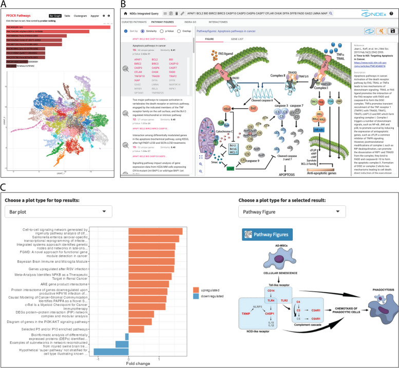
Fig. 1.
Pathway Analysis with PFOCR. A Typical bar graph of Enrichr results for PFOCR pathways, above. Appyter UMAP of PFOCR pathway clusters, below. The Enrichment Analysis Visualizer appyter computed term frequency-inverse document frequency (TF-IDF) values for the gene set corresponding to each pathway in PFOCR and plotted the first two dimensions of a UMAP applied to the resulting values. Generally, pathways with more similar gene sets are positioned closer together. Pathways are colored by Leiden algorithm-computed clusters. B NDEx iQuery screenshot showing ranked pathway figures (left panel), original pathway figure of selected result (middle), and article metadata (right). The top-right includes buttons to a dedicated NDEx page or to import the figure-extracted gene set into Cytoscape as nodes. C The plot options for ORA and GSEA results in the R Shiny tool called Interactive Enrichment Analysis. PFOCR results include a view of the original published figure and a link to a dedicated PFOCR website page (right)

