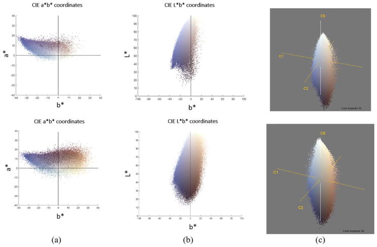
Figure 5.
Based on the two sample images shown in Figure 4(a), the top and bottom figures in (a) show the corresponding scatter plot of a* vs. b* color channel while the top and bottom figures in (b) show plot of L* vs. b* channels. (c) The Principal Component Analysis (PCA) projections for the two sample images in Figure 4(a). PCA rotates the current axis so that the eigenvector corresponding to the highest eigenvalue points in the direction of maximum information content in an image. [Color figure can be viewed at wileyonlinelibrary.com]

