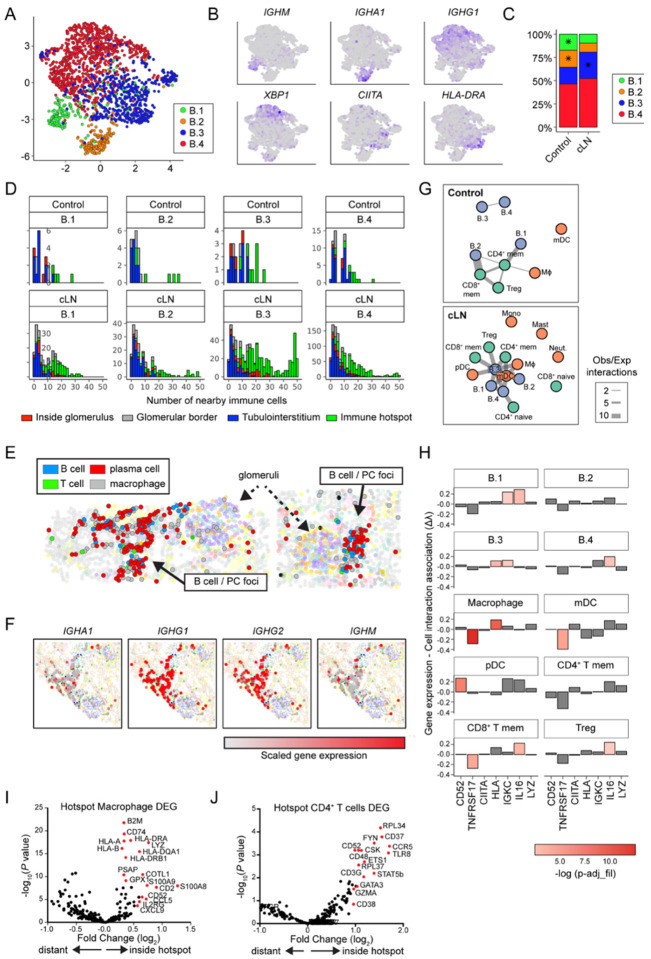
Figure 4: Gene expression and cell interaction patterns within immune hotspots.
(A) UMAP projection of B cell lineage subclusters B.1 – B.4. (B) Heatmap of gene expression in B cell subclusters. (C) Distribution of B cell subclusters in control and cLN. *P<0.05, by chi-squared test. (D) Histograms depicting number of the 50 closest cells to each B cell subset that are immune cells (color coded by B cell location and divided by disease status and B cell subcluster). (E) Clusters (solid arrows) of B cells, plasma cells, macrophages, and rare CD4+ T cells located with tubulointerstitium of representative cLN kidney. Dashed arrows indicate glomeruli. (F) Immunoglobulin gene transcripts (red=scaled gene expression) in cLN plasma cell foci. (G) Graphs of interactions between immune cell types that occur more frequently than would be expected by chance, as modelled by a hypergeometric distribution. Cells are colored by lineage and edge thickness is proportional to the ratio of observed:expected number of interactions across all patients. (H) Bar chart depicting the relationship between B.3 cell gene (or gene set) expression and the number of interacting cells. Height of the bar is the Poisson regression estimate of that gene (or set of genes). (I, J) Volcano plots showing DEG in cLN macrophages (I) and CD4+ T cells (J) residing inside vs. outside “immune hotspots”.

