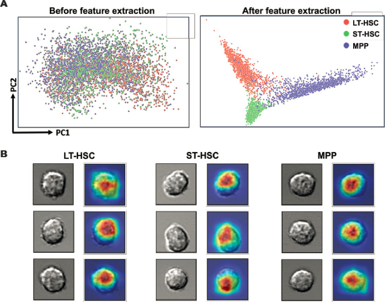
Figure 4. Interpretation of the LSM model.
(A) Cell imaging data were processed by principal component analysis and the PCA score plots show the striking difference that feature extraction by the LSM model can make. (B) Visual explanation of the LSM model. Cells from the three groups were randomly selected and their attention heatmaps in the LSM model were generated by Score-CAM. Red regions received the highest attention by the LSM model, while blue regions were largely ignored.

