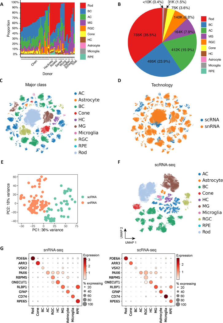
Extended Data Figure 1. Overview of the HRCA.
A. Cell proportion distribution of major classes among donors. The x-axis corresponds to each donor, and the y-axis is the cell proportion of major classes. The last bar is the cell proportion across total cells. B. A pie chart illustrating the number of cells for major classes and their proportions. C. Integration of datasets from snRNA-seq and scRNA-seq datasets. The cells are colored by major classes. D. The atlas is colored by the two technologies: snRNA-seq (in coral) and scRNA-seq (in blue). E. The distribution of transcriptomic data for 152 samples obtained from snRNA-seq and scRNA-seq technologies. Each sample is colored by the technology used. F. The atlas of scRNA-seq data, with major classes represented using different colors. G. Dot plots illustrating the distribution of expression levels of marker genes for major cell classes in snRNA-seq (on the left) and scRNA-seq data (on the right).

