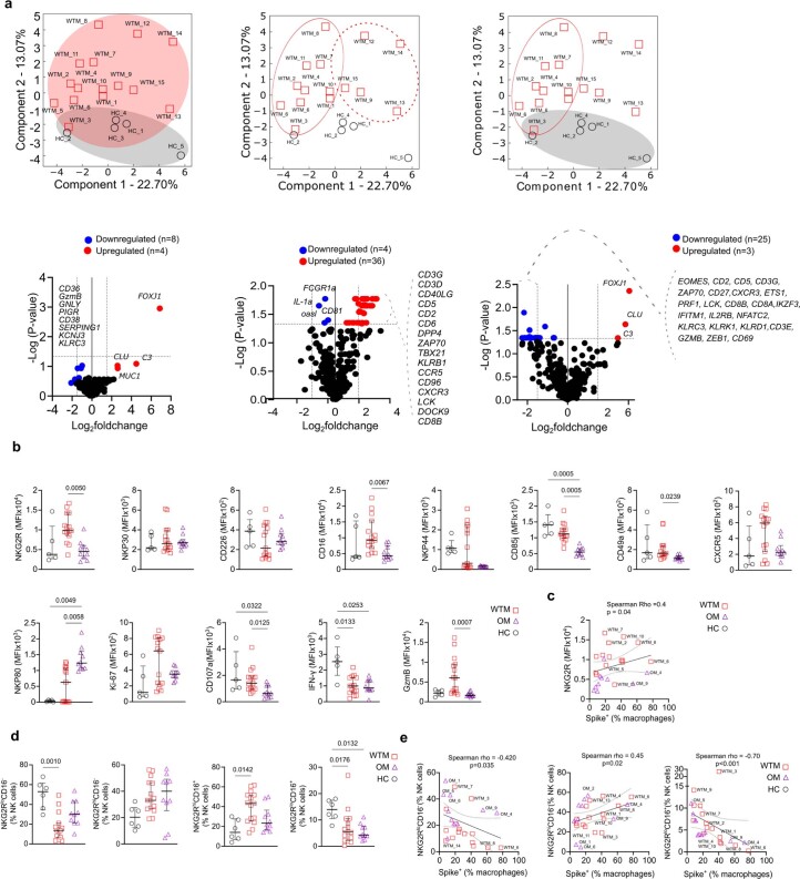
Extended Data Fig. 6. Transcriptome analysis of BALF NKG2R+ NK cells.
(a) Top: PCA shows the clustering pattern of WTM and HC samples. Red circles represent WTM, and gray circles represent HC. Each PCA plot indicates the specific comparison performed. Bottom: Volcano plots highlight genes significantly up-regulated and down-regulated in various comparisons, using p-values instead of Padj. Horizontal lines represent p-value = 0.05, and vertical lines indicate log2 fold change > 1 or < -1. (b) Comparison of MFI for various markers on BALF NKG2R+ NK cells isolated from HC, WTM, and OM at least 221 days p.i. (c) Spearman correlation analysis between NKG2R MFI on BALF NKG2R+ NK cells from WTM and OM isolated at least 221 days p.i. and Spike+ Mac measured as in Fig. 2. (d) Comparison of NKG2RloCD16−, NKG2RhiCD16−, NKG2RhiCD16+, and NKG2RloCD16+ populations among bulk NK cells, measured on BALF NKG2R+ NK cells from HC, WTM, and OM isolated at least 221 days p.i. (e) Spearman correlation between the frequency of NKG2RhiCD16−, NKG2RhiCD16+, and NKG2RloCD16+ populations among bulk NK cells (as in (d) and Spike+ Mac measured as in Fig. 2. For all Spearman correlations, the black solid line represents linear regression, and dotted lines indicate the confidence interval (95%). Symbols represent individual macaques, bars indicate medians, and interquartile ranges are shown. p-Values were determined by Kruskal-Wallis test with Dunn’s post-test.

