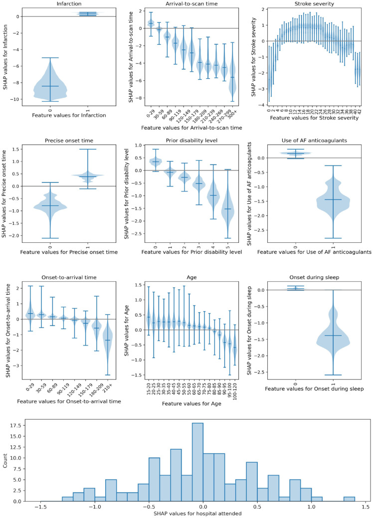
Figure 2.
Plots showing the relationship between SHAP values and feature values. Top: Violin plots showing the relationship between SHAP values and feature values. The horizontal line shows the median SHAP value. The plots are ordered in ranked feature importance (using the mean absolute SHAP value across all instances). Bottom: Histogram showing the frequency of SHAP values for the hospital attended.

