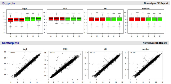
Figure 4. Example of plots generated by the normalyzer tool and provided in the .pdf report.
Boxplots (top) and scatterplots (bottom) are two of the evaluation measures within the normalyzer report. Samples are grouped based on their condition to provide users with an easy way to evaluate the suitability of different normalization methods for their data. The log2 data can be used as a reference to compare the data pre- and post-normalization.

