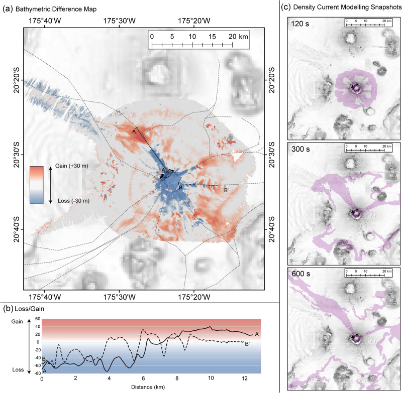
Fig. 2. Seafloor difference map and density current modelling snapshots.
a Difference map showing the relative gain (red) and loss (blue) of seafloor when comparing pre-eruption bathymetry with post-eruption bathymetry. Coastlines pre (dashed) and post (solid) eruption are shown. Indicative density current flow paths (i.e., an accessible visualisation of the general flow pathways simplified from the model output animation provided (see Supplemental Movie 1 and Fig. S6)) are indicated with dashed grey lines plotted over the difference map to enable comparison of density current flow paths with the difference map results. b Solid (A-A’) and dashed (B-B’) black lines showing gain/loss along prominent volcaniclastic density current flow pathways, with the location of these profiles shown in (a) with corresponding solid and dashed lines. c For further context, select snapshots from the model animation (provided in Supplemental Movie 1) are provided at 120, 300, and 600 s into the modelling output. For these density current modelling snapshots, the map frame extent is the same as for the difference map, and the background imagery is 2022 multidirectional hill shade.

