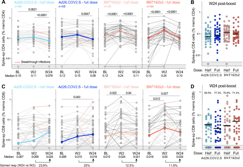
Figure 8: Kinetics of SARS-CoV-2 spike-specific T-cell response after vaccination.
(A) Longitudinal frequencies of spike-specific CD4+ T-cell responses induced by the four different booster vaccine regimens. (B) Comparison of the frequency of spike-specific CD4+ T cells between the four arms at W24 post-boost. (C) Longitudinal spike-specific CD8+ T-cell responses induced by the four booster vaccine regimens. (D) Comparison of the frequency of spike-specific CD8+ T cells between the four arms at W24 post-boost. The proportion of spike CD8+ responders is indicated at the top of the graph. The grey shaded area indicates undetectable response. The color-coded dots and bold lines in (A) and (C) represent the median at each time point. Recorded BTI between W2 and W24 are depicted with a red line. A Friedman test with Dunn’s correction was used to assess statistical differences between paired samples and a Kruskal-Wallis with Dunn’s corrections was used to compare different groups.

