Figure 1.
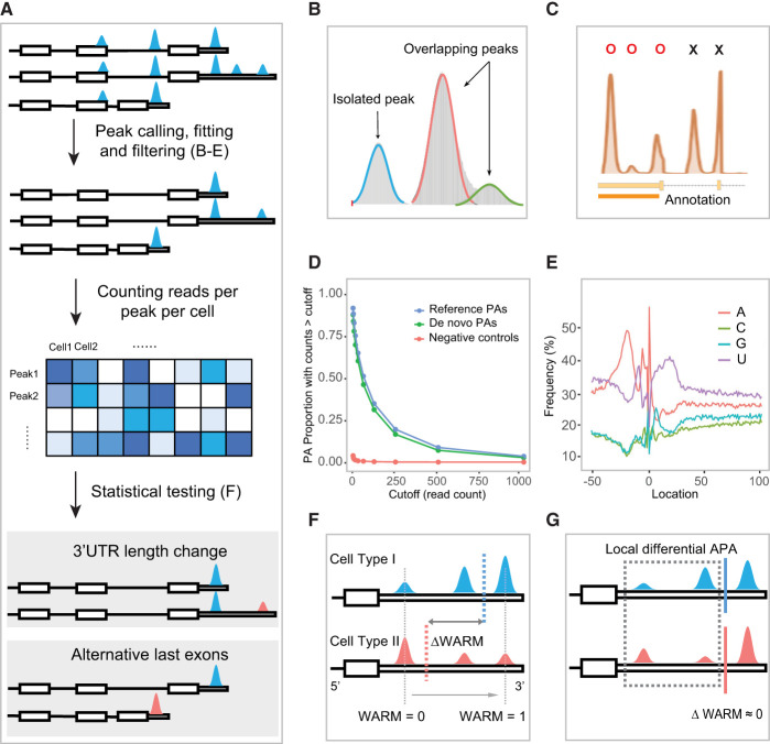
Schematic overview of the Infernape pipeline. (A) Overview of the Infernape workflow. (B) Overlapped peaks are fitted and separated with a Gaussian mixture model. Peak mode detection and filtering. (C) Peak modes are first identified based on smoothed unique UMI coverage curves, and non-3′-UTR region peaks are filtered out. Using Ephb2 (E18.5 mouse brain) as an example, peak modes in reference 3′-UTR regions are labeled by Os, and excluded peak modes are labeled by Xs. (D) The proportion of Infernape-identified peaks associated with de novo PAs, known PAs, and corresponding read counts in a 150-bp window downstream from each peak mode. The read counts were derived from bulk RNA-seq of the E14.5 RGCs and neurons. PAs of genes that are not expressed in the scRNA-seq data are used as the negative control. The read counts of de novo PAs (green) are comparable to that of known PAs (blue), and both are substantially higher than the negative control (red). (E) Nucleotide frequency around PAs identified by Infernape (adult mouse brain data) showing the A- and U-rich regions. Position 0 indicates the cleavage/PA site. (F) An illustration showing the weighted average relative mode (WARM) value, which summarizes the relative PA usage of a gene based on all its PAs. Blue and red dashed lines indicate the WARM value for the two cell types. Gray dashed lines indicate the lower and upper bound for the WARM value. (G) An illustration showing the maximum difference in proportion change (MPRO) value, which measures the greatest local PA change. Blue and red lines indicate similar WARM values for the two cell types for which the local difference may be masked by the averaging effect. MPRO results indicate that the two proximal PAs show significant local differential usage.

