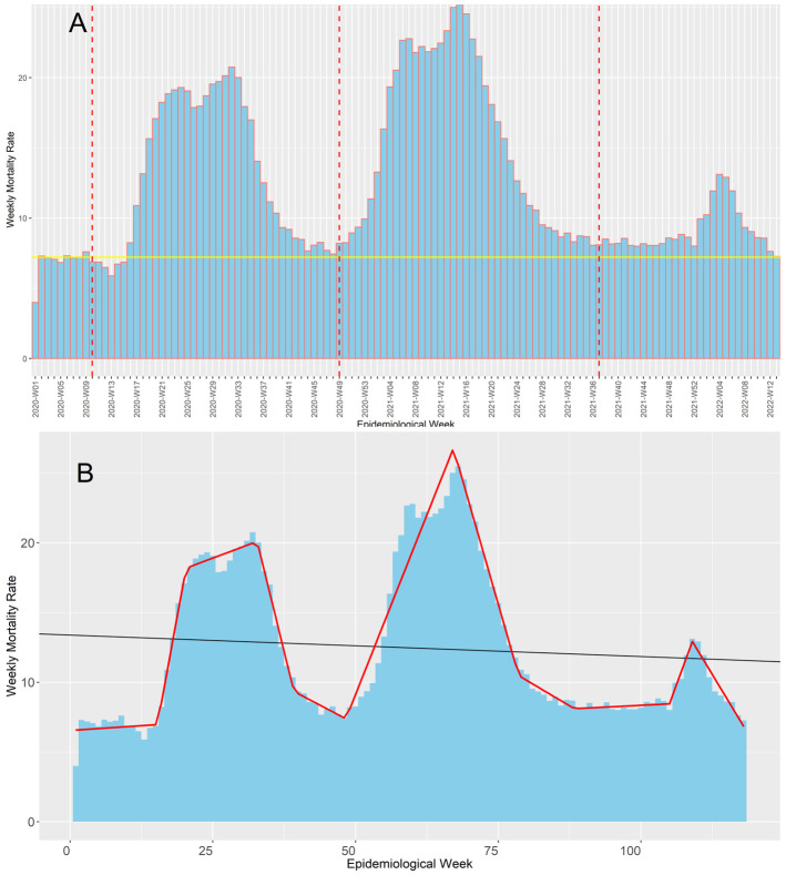
Figure 1. Evolution of the COVID-19 weekly mortality rates* during Peru's first, second, and third COVID-19 waves.
The figure shows the evolution of the weekly mortality deaths (death counts per week /100,000 inhabitants of Peru) along the pandemic in Peru ( Figure 1A) contrasted with the baseline mortality pre-pandemic (continuous yellow line) and the beginning epidemiological week of the first, second, and third COVID-19 waves in Peru (red dot lines). Also, it shows the trends estimated in our segmented regression analysis (continuous red line), which we used to determine when each wave started ( Figure 1B).

