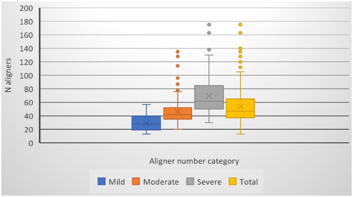
Figure 1.
Median scores for the initial and refinement number of aligners per patient according to aligner number category. Box plots provide information about sample distribution. The boundaries of the rectangle indicate the 25% and 75% quartiles. The line inside the rectangle indicates the median. The distance between the median and the quartile indicates the skew of the data. The two lines (whiskers) and dots extending from the box indicate the outlier values. N, number.

