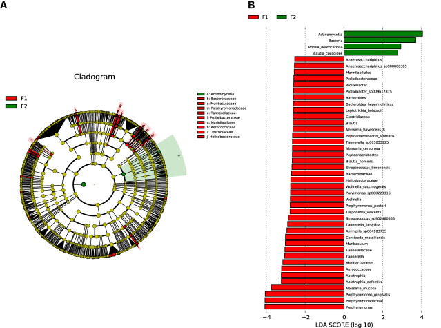
Figure 4.
Analysis of species diversity in the normal-to-mild and moderate-to-severe coronary AS groups. (A) Cladistic map of microbial evolution. (B) Histogram of LDA value distribution. In the evolutionary branching diagram, circles radiating from the inside out indicate taxonomic levels from phylum to genus (or species). Each small circle for a different taxon class represents the taxa of that class, and the diameter of the small circle is proportional to the relative abundance. Species with no significant differences are yellow; red nodes represent the microbiota playing an important role in the moderate-to-severe group; and green nodes represent the microbiota playing an important role in the normal-to-mild group. Bar length in the histogram indicates the size of the impact of different species (LDA score). (F1: moderate-to-severe coronary AS group; F2: normal-to-mild coronary AS group).

