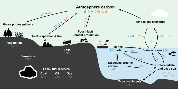
Fig. 1.
A schematic diagram of the main Earth’s carbon cycle shows the movement of carbon between the atmosphere, lithosphere, hydrosphere, and biosphere. The blue numbers represent natural fluxes or stocks, and the orange numbers represent anthropogenic fluxes or stocks (Flux: Billion tonnes of Carbon per year, PgC/yr; Stocks: Billion tonnes of Carbon, PgC). Data source: IPCC Sixth Assessment Report, Work Group 1, Chapter 5 (2021).

