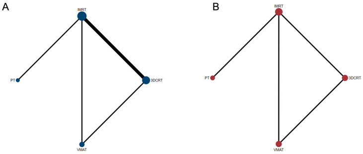
Figure 1.
Network structure diagrams. (A) Overall survival (OS); (B) progression-free survival (PFS). In this network figure, each node represents a different treatment, and its size depends on the number of patients that were directly examined. The nodes are joined by lines with different thicknesses, which show whether there was a direct relationship between treatments, and the thickness is weighted according to the available direct evidence between them.

