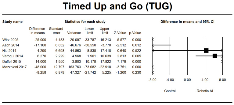
Figure 13.
Forest plot of TUG using standardized mean difference analysis between robotic and control groups. The square box represents the mean differences for the respective study, while the horizontal line is the 95% CI. The diamonds represent pooled results. Wirz et al., 2005 [23]; Aach et al., 2014 [26]; Niu et al., 2014 [29]; Varoqui et al., 2014 [31]; Duffel et al., 2015 [32]; Mazzoleni et al., 2017 [35].

