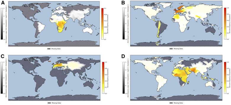
Figure 1.
Examples of SMapper-based global spatial prevalence visualizations of human genotype or phenotype data. (A) Map for Y-haplogroup E-M75 (E2); (B) map for the lactase-persistence conferring allele of SNP rs4988235; (C) map for blue eye color; (D) map of consanguinity rates. Interpolated NZF estimates are presented along a yellow-red gradient whereas interpolated ZFE estimates are grey-shaded by the inverse of the sample size. Regions with absent data are clearly marked as hatched. Note the different NZF scales used in the panels.

