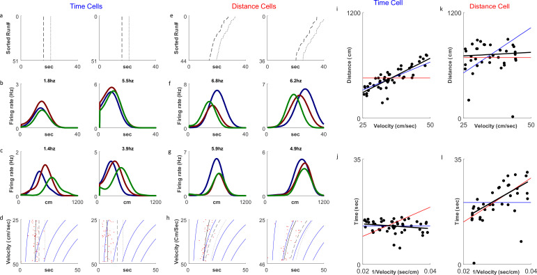
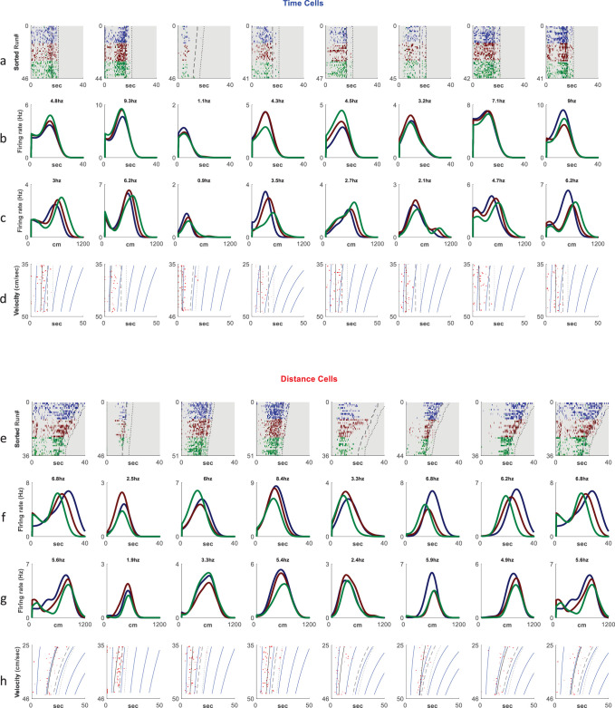
Figure 2. Distance and time cells coding.
(a–h) Examples of two time-coding cells (columns 1–2) and two distance-coding cells (columns 3–4). Row a depicts neural firing as a function of the distance the animal traveled, sorted by the runs’ velocities. The colors represent three velocity groups for which the tuning curves, by time or distance, are presented in rows b and c, respectively. Row d shows the onsets of each run (red dots) and their linear fit (black curve) to the relation for the time cells and for the distance cells. The dashed curve represents the end-of-run time, and the dotted curve represents the end of the analyzed period (treadmill stop time, plus 5 seconds). The blue curves are equi-distance points in time. A black curve (the linear fit) which is parallel to the equi-distance curves demonstrates a cell with strong distance coding. (i–l) Examples of the analysis of time (i, j) and distance (k, l) encoding cells. Top row plots depict distance vs. velocity and bottom row plots depict onset vs. 1/velocity. Red line represents an ideal Distance Cell, based on the average distance traveled until the onset time. Blue line represents an ideal Time Cell, based on the average time of the onset and the black line is the linear fit. The closer the slope of the black line is to that of the red line, relative to slope of the blue line, the more the cell encodes distance-encoding, while if the slope is closer to the slope of the blue line, the is more it is time-encoding.


