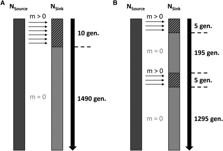
Fig. 1.
Schematics of admixture models, each simulated for a total of 1,500 generations. A) SP model. B) MP model. Rectangles represent source (dark gray) and sink (gray) populations, with solid rectangle depicting generations in isolation and hashed rectangles depicting generations of admixture, small unidirectional arrows symbolize gene flow between populations and indicate its direction, and solid large arrows represent time with the number of generations spent in isolation or admixing given on the side. NSource/NSink, Source/Sink initial population size (100 individuals); m, migration/admixture rate (either 0.03, 0.1, or 0.3 depending on the scenario simulated).

