
Fig. 5.
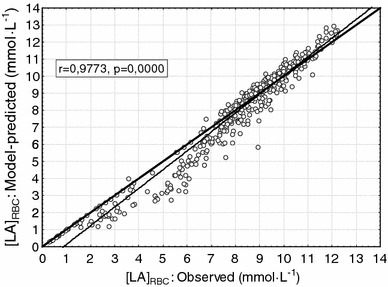
Correlation between the observed and the model-predicted [LA]RBC for all 11 subjects, under all three warm-up conditions, and at all 14 time points for blood sampling [t(0) to t(13)]. Thus, the graph includes 11 × 3 × 14 = 462 circles where each circle represents the observed and the model-predicted values of [LA]RBC for a given subject under a given warm-up condition at a given moment for blood sampling. The thin solid line shows the best linear fit, which is close to the thick solid line, which means the equality of the observations and the model predictions. The very good and very significant correlation is shown by r = 0.9773 and p = 0.0000