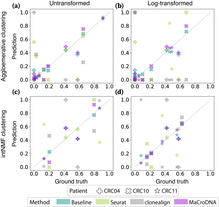
Fig. 3. Correlation between the true and predicted clonal prevalences from different methods.
In each plot, the x and y-axis indicate the true and predicted clonal prevalences, respectively. Each dot shows the true and predicted clonal prevalence of a patient-specific clone obtained from a method when the clustering algorithm and the input data to the clustering algorithm were a the agglomerative clustering and the original data, b the agglomerative clustering and the log-transformed data, c intNMF and the original data, and d intNMF and the log-transformed data. The shapes of the markers correspond to different patients (see the figure legend). The colors of the markers indicate a particular method: cyan for the baseline method, green for Seurat, gray for clonealign, and purple for MaCroDNA. Source data are provided as a Source Data file.

